This post is part of my weekly series of posts showing the most inspiring images of the week. This is also known as my scratch list. As my design and creative mentors have always said “scratch even when you don’t itch.” So I like to keep a list of designs, products, logos, and photos that inspire me to look at later when I am itching for creativity 😀
If you want to participate and share your graphic design inspiration, You can submit your images and inspiration by commenting on this post or emailing them to ericekidwell@proappslive.com

What’s cooler than the game of chess? If you said “nothing” then you’re wrong! It’s chess a chess board that can easily help you visualize which pieces have done the most damage! I love product designs solve a problem while looking good.
Co.Design


I would probably never buy this shirt for myself. I bet after seeing these pics, you imagined yourself being asked to show your ninja disguise while wearing this shirt, didn’t you? lol
You can get them here: Ninja and T-Rex
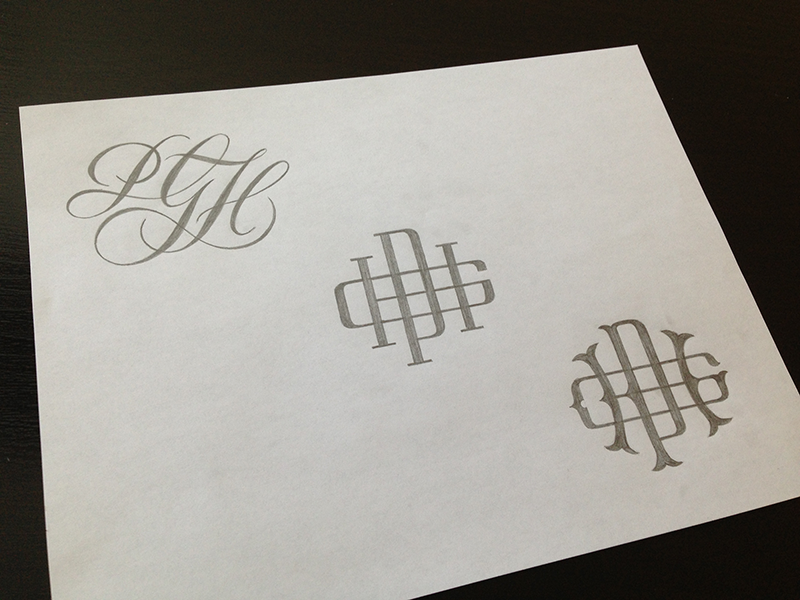
I’m becoming quite fond of monograms.
Ryan Hamrick

I love the feeling this photo gives you.
See the entire collection here


I always have and always will love hipster lion illustrations!
Wirtuo7
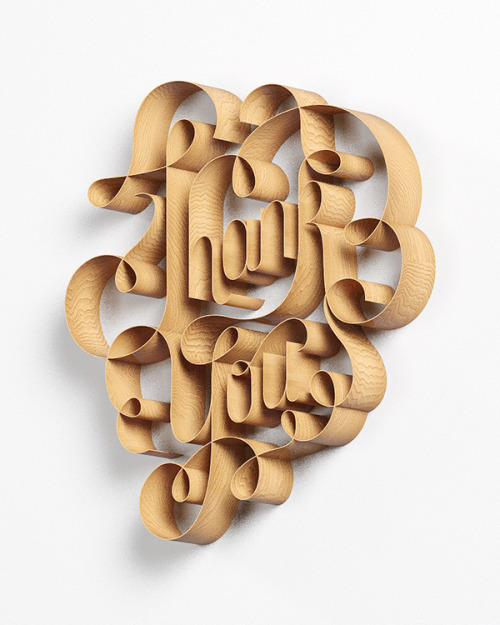
This seemingly effortless illustration is made possible by meticulous shading. I love how this looks like wood shavings.
David McLeod
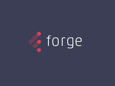
This is a creative way of conveying forging on ahead.
Pete Lacey

This guy does good work with typography and a pen to the paper.
Sean McCabe
I’m working on a product idea involving clouds and besides, I really loved this movie!
Zachary
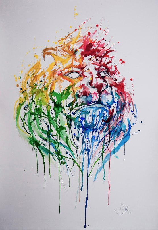
This lion looks likes chaos, but I know that had to have taken a lot of control.
Awesome Inspiration


This is very clever. The first one was easy, but did you figure out the second one?
Ludwig Mies Van Der Rohe
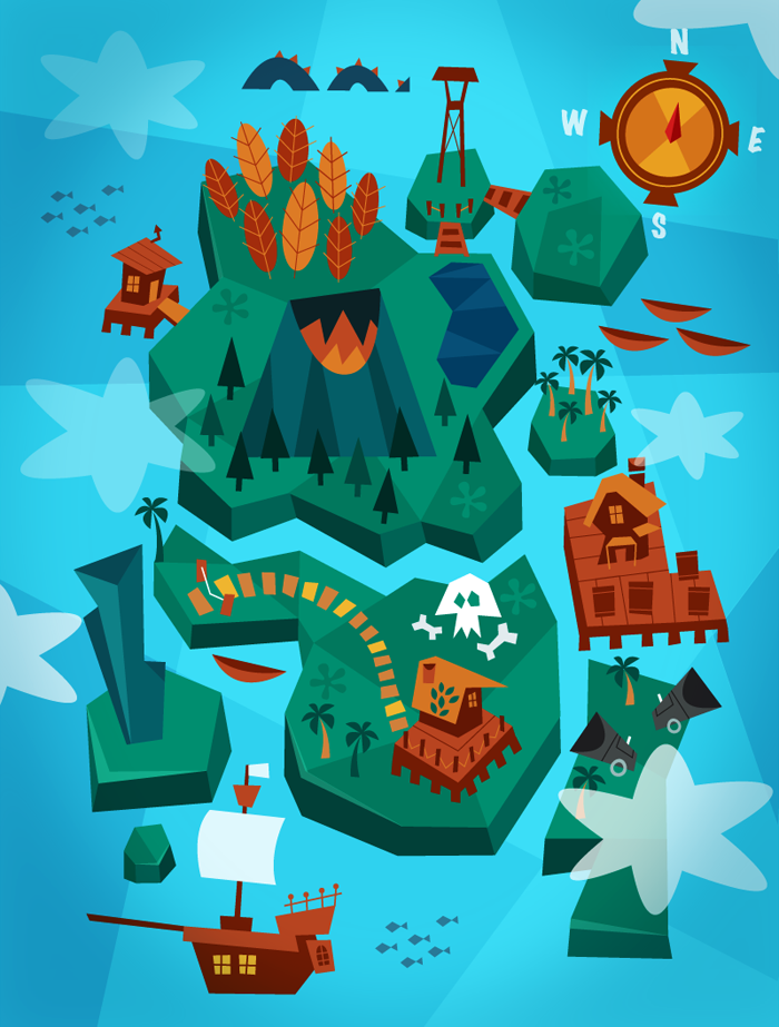
This makes me want to be a kid again or at least put it on my boy’s wall.
Momo and Sprits

This speaks to me. The relationship comes before the project.
Lanis Soteras
I’m loving the shadow over this B, it really makes it memorable and it stands out.
Cortny Cotton


Paint in motion. This artist put acrylic paint on a drill, got an hd camera, and let the fire works begin!
Fabian Oefner
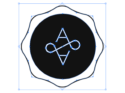
This is a nice way to connect two letters in a pattern.
Petrov

This is a great idea for business cards: Take the logo and blow it up on the back and try different colors that compliment the main theme going on.
Marc Reyes

Coffeeeeeeeeeeeee love.
Communication Agency
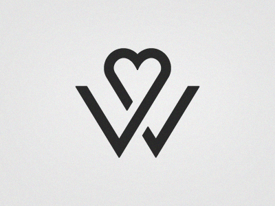
This is a creative wedding logo.
Rich Williams

Monogram style. Clarke Harris made this logo for his sister’s blog.
Clarke Harris
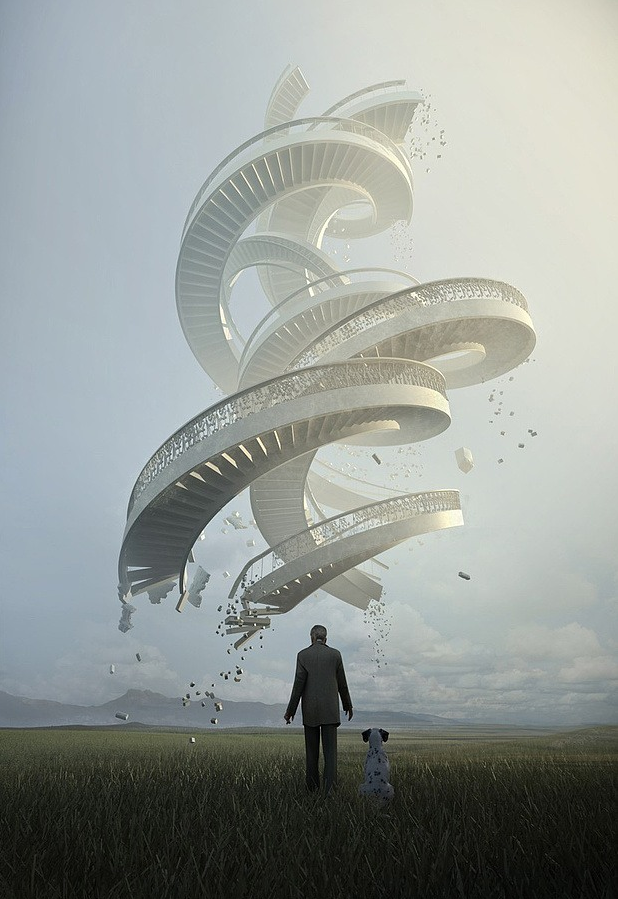
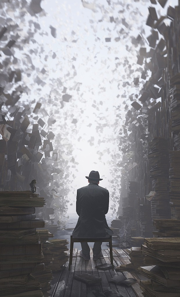
Sometimes the only word that can do it justice is Wow.
Jie Ma
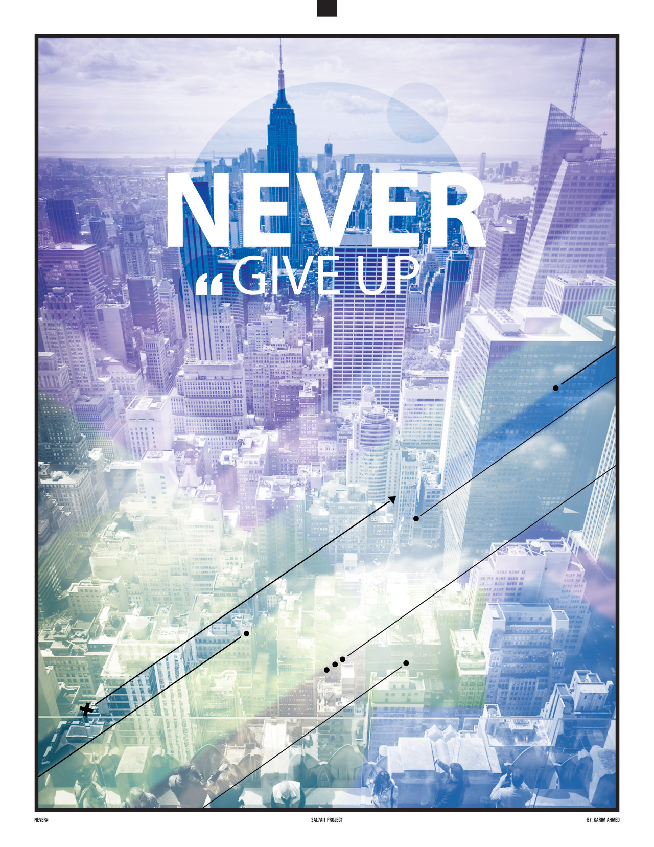
Don’t you ever give up!
3al7ait
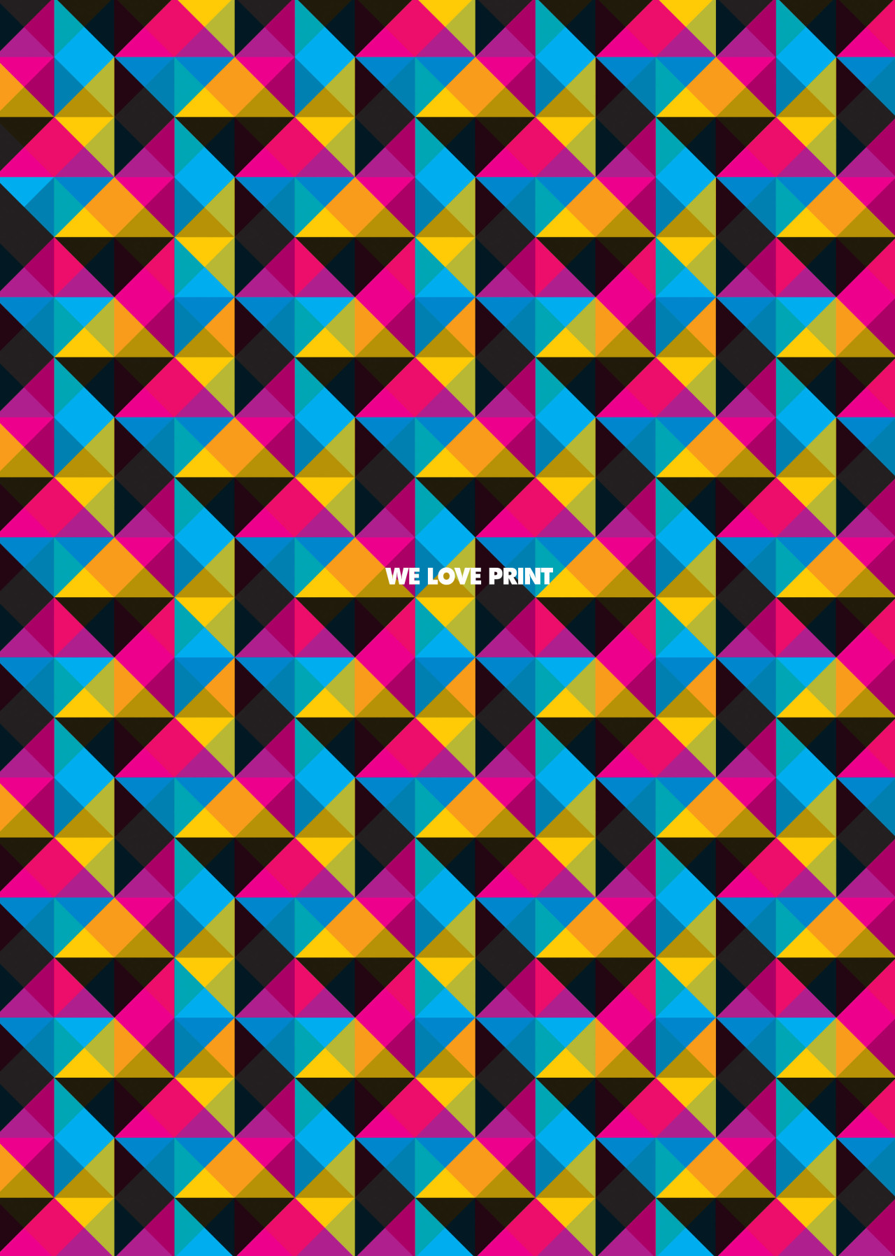
Patterns and a few colors will never go out of style.
ElementInk

I’m loving this low-polygonal style popping up lately.
NFNTY
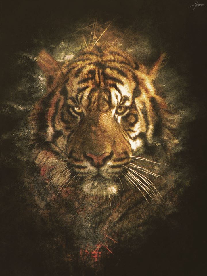
What can I say, I’m a cat guy 😀
Mauro Xeneize Arts
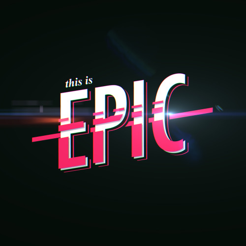
This is a nice style to emulate. The very bottom of the title is the most interesting to me as well as the subtle shadow and pink stroke behind the white lettering.
Muhammad Hafiz
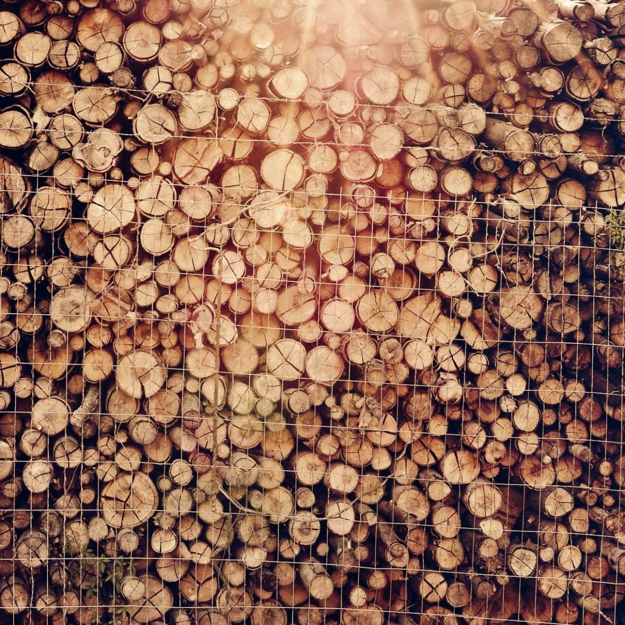

This instagramer takes awesome photos. These would be awesome backgrounds for quote posters.
Diego Carneiro
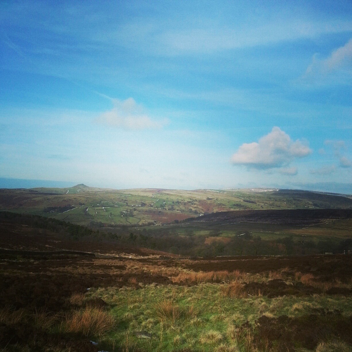
I wish we had these kinds of hills in Illinois!
Jay Hussain

More than meets the eye! I love transformer furniture!
Matthew Pauk
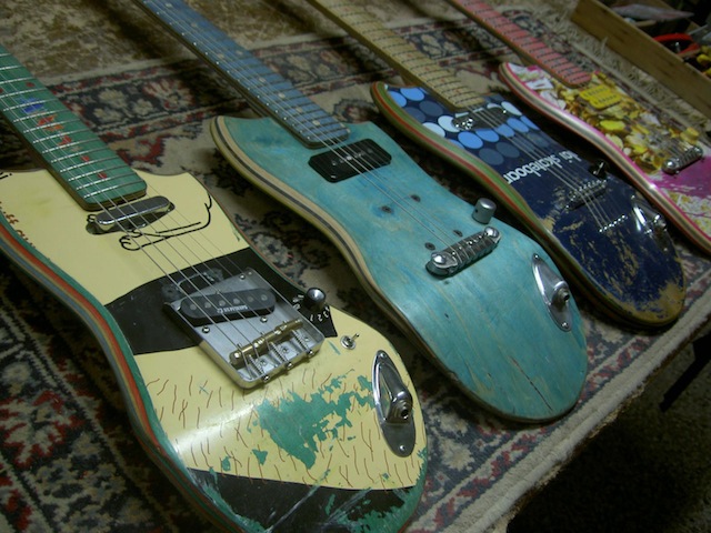
Repurposed guitars made from shredded skateboards? Sign me up!
Skt Gtr
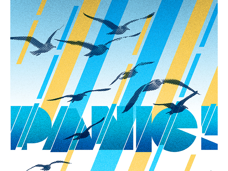
The lines cut through the title like a knife. I love the colors, the font, and this style.
Jeremy Bacharach
