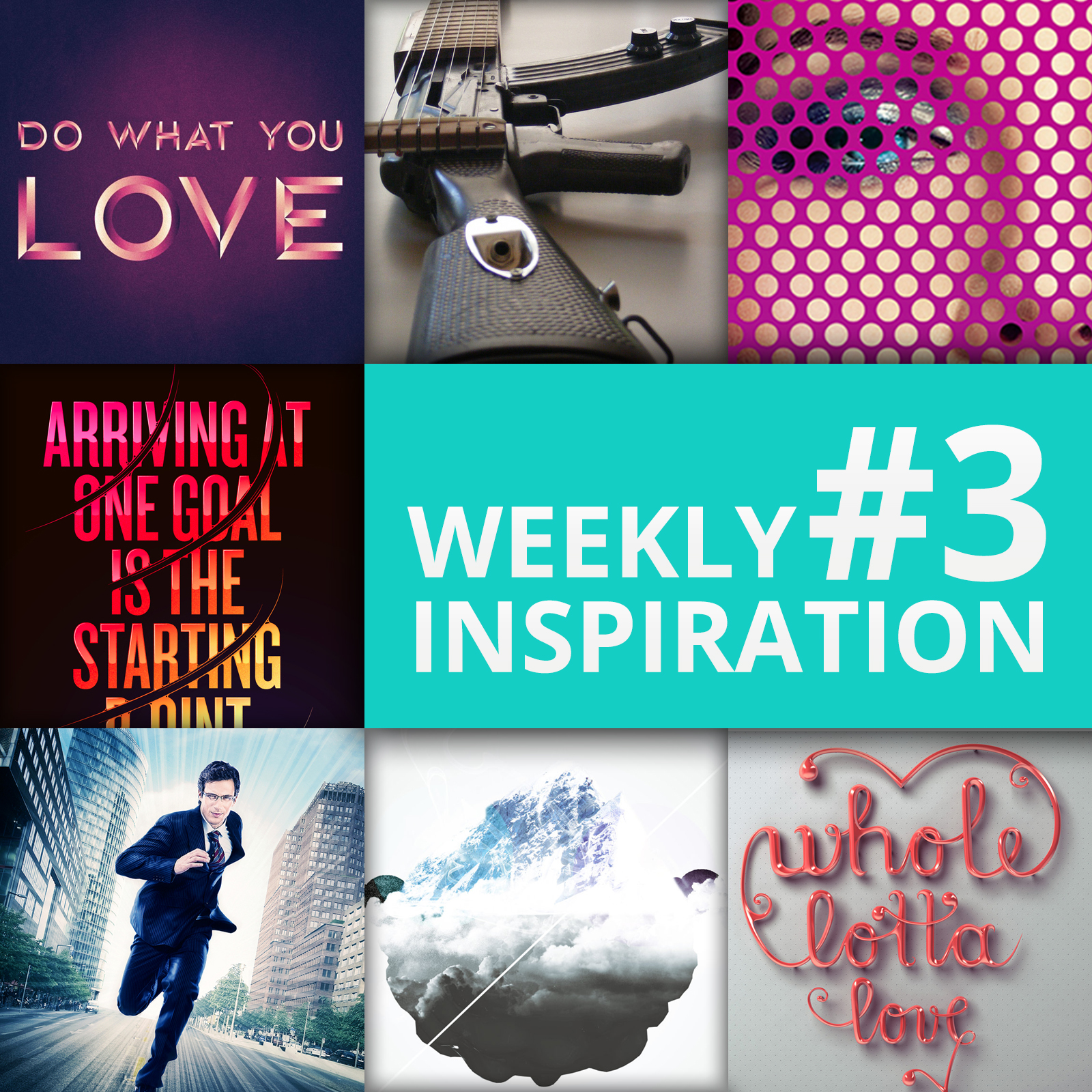
This post is part of my weekly series of posts showing the most inspiring images of the week. This is also known as my scratch list. As my design and creative mentors have always said “scratch even when you don’t itch.” So I like to keep a list of designs, products, logos, and photos that inspire me to look at later when I am itching for creativity 😀
If you want to participate and share your graphic design inspiration, You can submit your images and inspiration by commenting on this post or emailing them to ericekidwell@proappslive.com
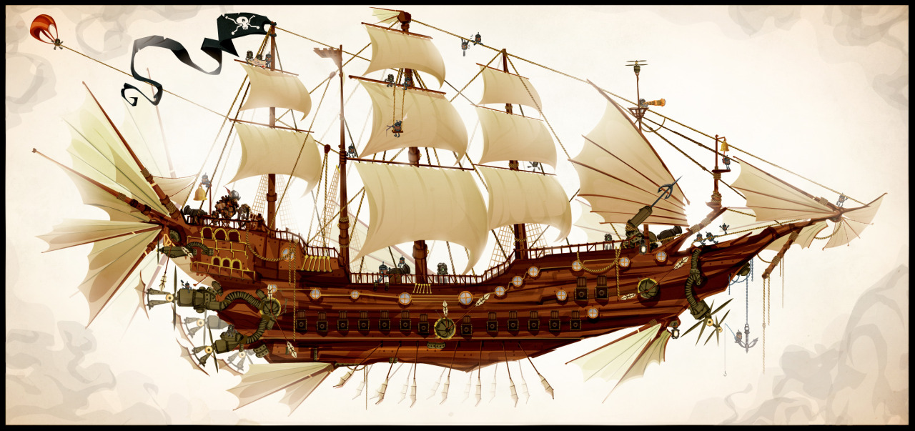
This design begs you to close your eyes and daydream for a bit.
chaseartwork
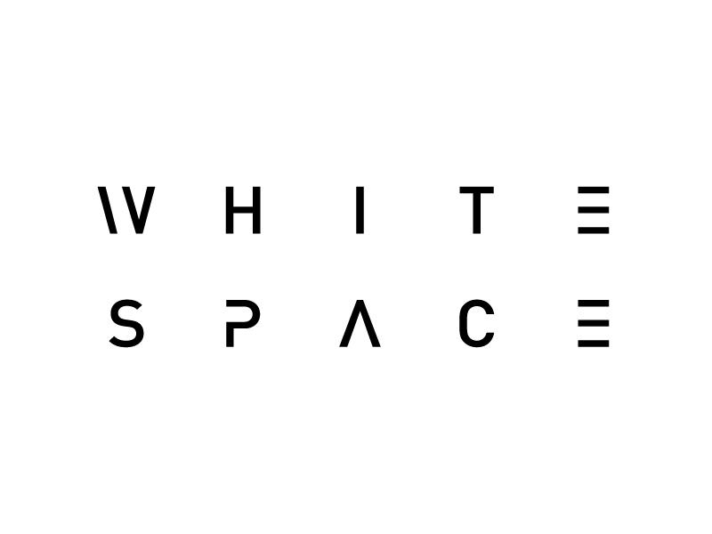
You can’t be a designer until you understand and value white space.
Kareem Taftaf
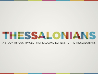
This is a start of a great idea and something I plan to use as inspiration in the future. The only thing I would update is making the S’s and the O’s fit into the whole scheme. You can make an S with two little c’s and an O with two big C’s.
Matt Scribner
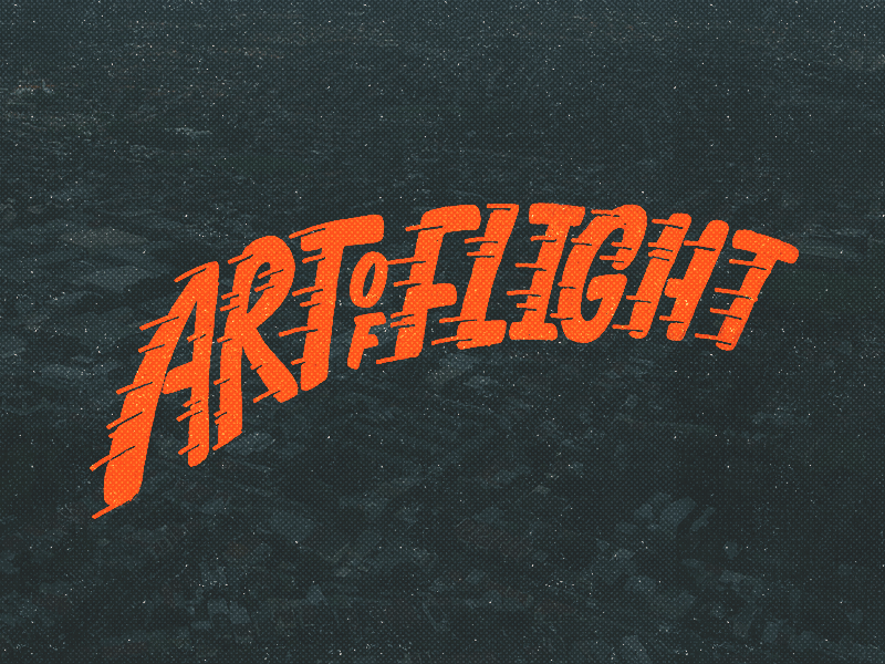
The streaks help convey motion. Also, the font style is very reminiscent of the old airlines back in the 50s.
Dave Coleman
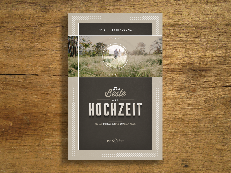
This was designed for a Christian German book on marriage. The style of this is very fresh and new, yet some elements harken back to the 60s with the diagonal line shadow behind the title.
Peter Voth
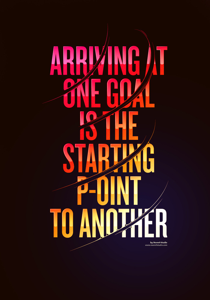
The beautiful colors, awesome quote, and cool swipes make this very unique and well put together.
noem9studio
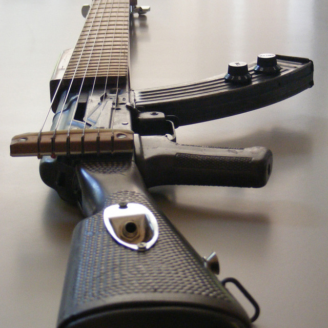
Talk about heavy metal! If I was a hard rocker, I’d think this guitar alone would make you legendary. This design essentially turned an instrument of death into an instrument of life.
bernabe

I love the colors and look of this font. It’s very stylistic and can be used for a variety of applications.
aicatch

This will work great someday as a background for a quote poster for me.
airows

A concrete paradise. What a gorgeous cityscape! This has to be photoshopped because it seems like this city just goes on for days!
Aleks Ivics
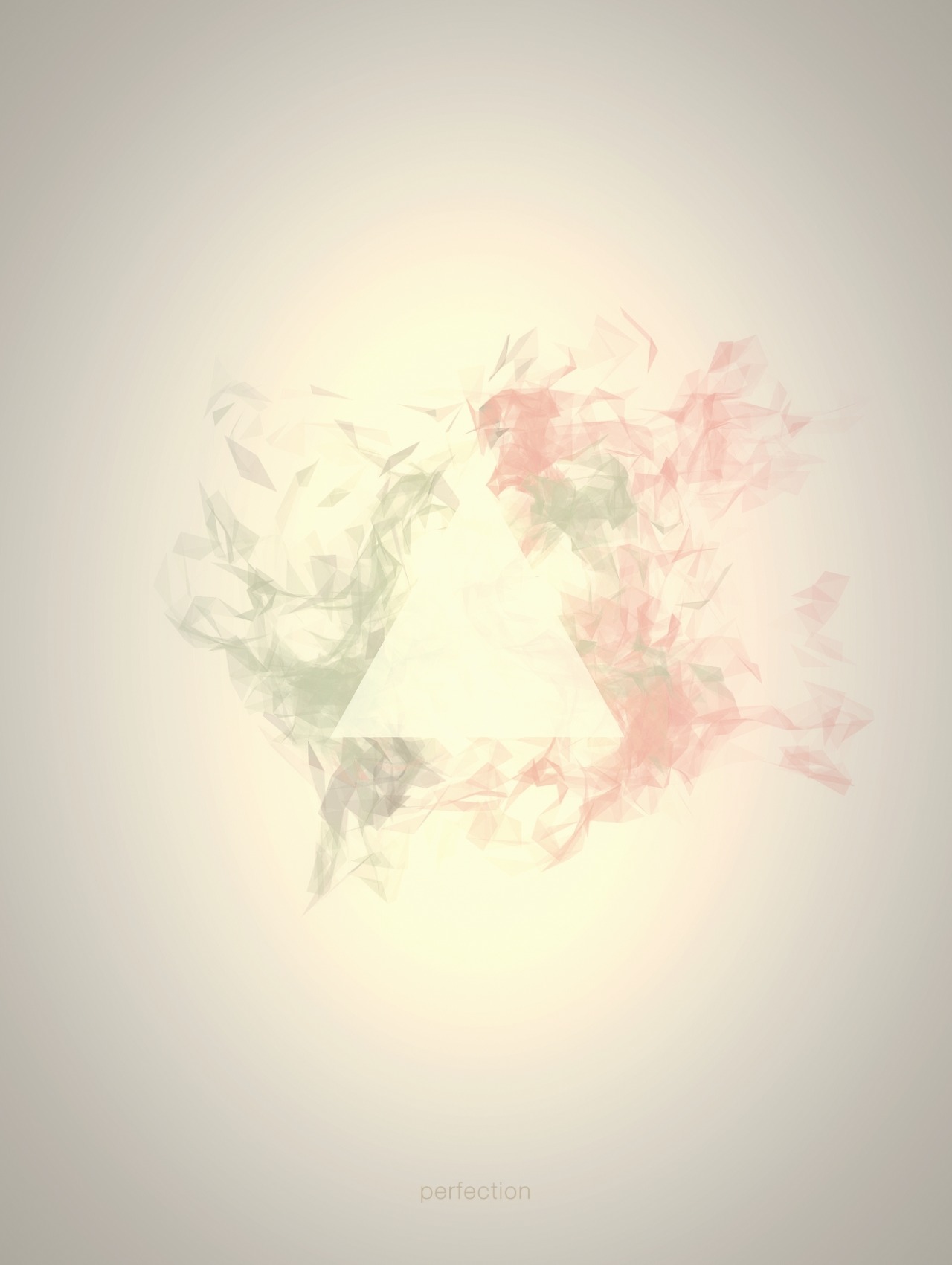
I love the colors and the subtlety of this piece.
Maciej
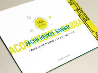
This is a future sermon graphic idea.
Chilly P.
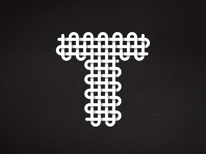
I really like this idea of creating letters by making it look like it was knit together. Might be useful for a graphic that you want to turn the first letter into a dropcaps.
Michael S.
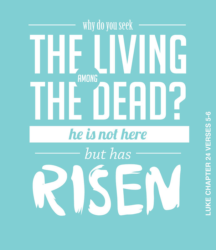
The main idea I like about this design is the word “among” being framed by a circle, almost like among is surrounded among the other words.
Richard B.
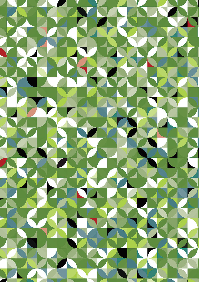

The simplicity of this is what really makes these designs by mysanaa stunning and eye catching.
Mysanaa
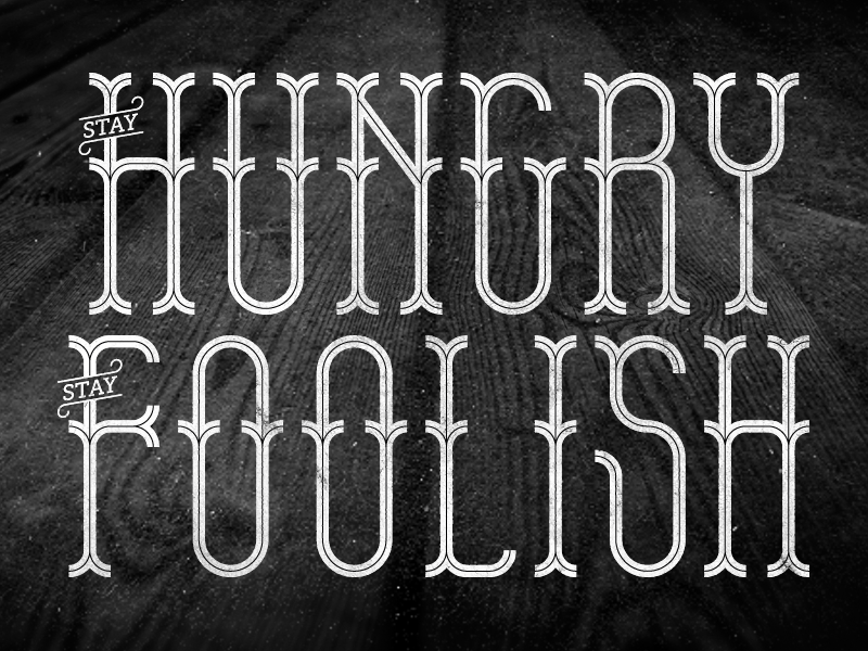
I love this style and I love this quote.
ohmytype

This photo by Jeff Liu has a very mysterious feel to it. It almost makes you want to imagine a story for this character.
Jeff Liu
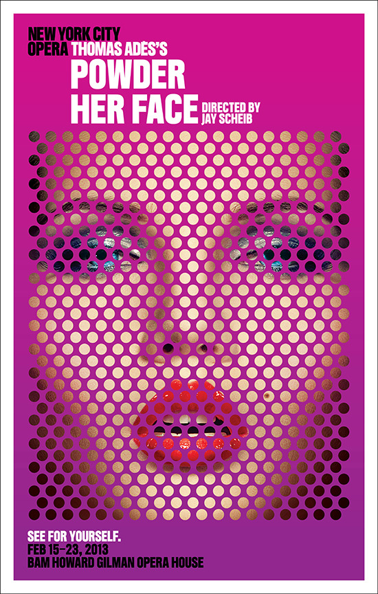
I love this idea of dots/circles defining a picture or the background.
Houke K.

What an awesome execution of motion and energy.
aidystudio
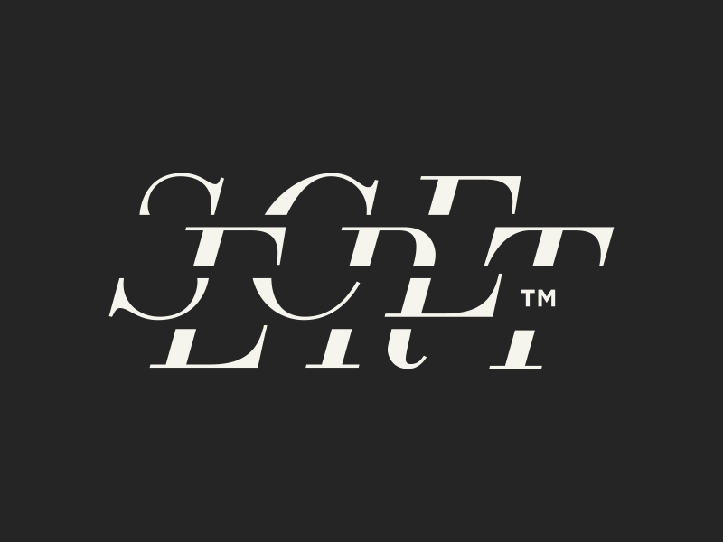
This is a very cool idea that goes with the title of this piece. It’s more complicated but not too complicated to understand the gist of this design.
Roger D.
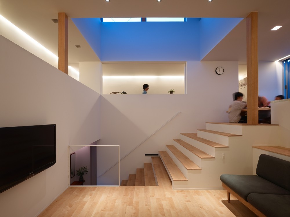


The floor plan in this house is just revolutionary. It’s cool how one of the steps is also part of the flooring of another level in the room.
Fujiwarramuro Architects
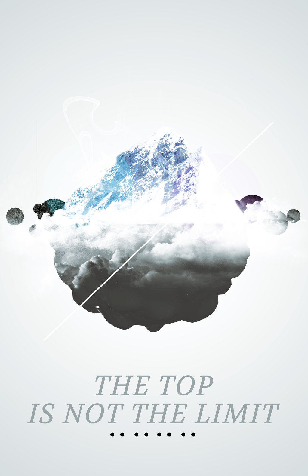
The design is cool, but the quote and idea is cooler.
pipetp

This is a nice way to portray love in the shape of a heart.
Nejc P.
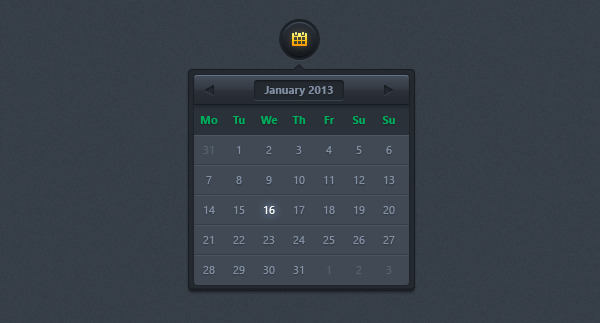
Sometimes I have to create calendars into designs and user interfaces (UI) for different things that I’m working on. This would be useful in the future as inspiration for future calendars that works. I love the subtle glow on the selected date.
inspirationfeed
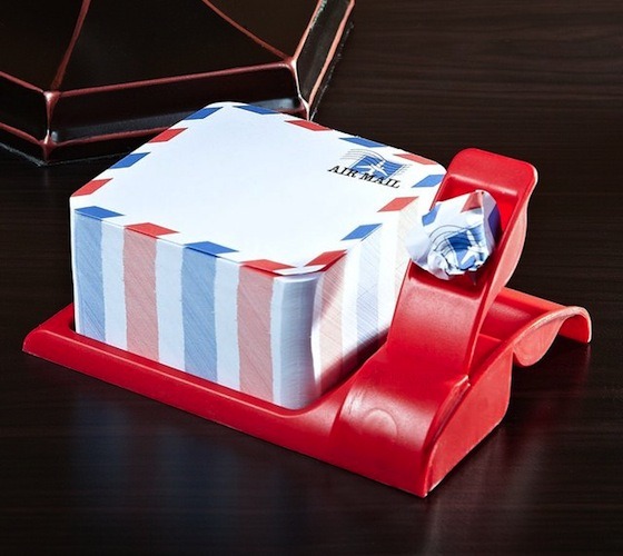
Gotta note to send to someone? Look no further than with this Airmail notepad lol you can get yours for only 12 bucks by clicking the link below.
The gadget flow
