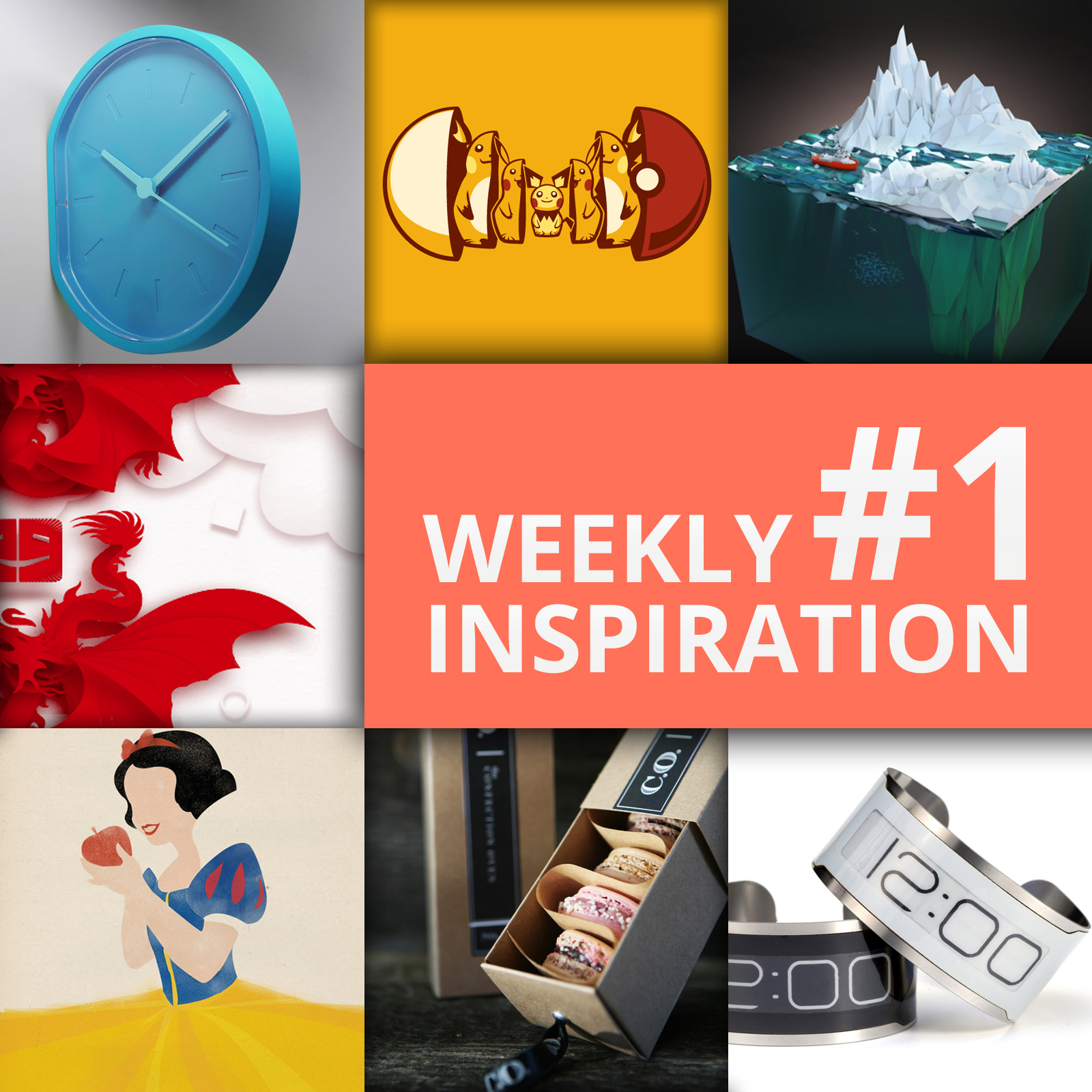
This post is part of my weekly series of posts showing the most inspiring images of the week. This is also known as my scratch list. As my design and creative mentors have always said “scratch even when you don’t itch.” So I like to keep a list of designs, products, logos, and photos that inspire me to look at later when I am itching for creativity 😀

This looks like a fun and tasty way to enjoy waffles!
Sapore Dei Mobili
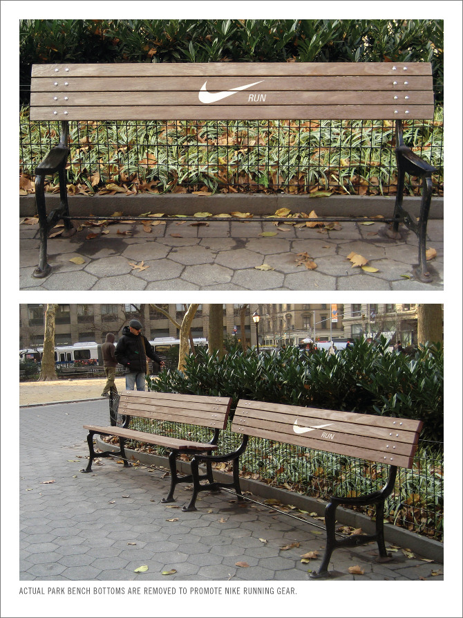
What a creative way to advertise for your company. In one word it says, “Run”. Visually it says, “Can’t sit here!”
Annie Chiu



This style really intriques me. I love the thought of what it’d be like living in a polygonal world.
Aldo Pulella
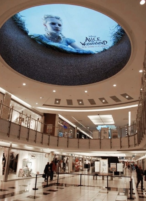
Also, known as guerrilla marketing, this is a very clever use of existing space underutilized. For instance, why doesn’t every barber shop and hair cut place have something on the ceiling, above the sinks?!
Daniel Nelson
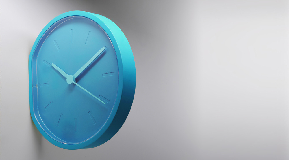
A clever way to solve a problem. “How do we put a clock on it’s side and attach it to the wall?” Flatten one of the sides, of course! Not only is it practical, but it makes an awesome design statement as well!
Ludoroth

Throwback elements in design will never go out of style.
EOS

I’m going to use this sometime in the future as a background for a design.
Amr Tahtawi
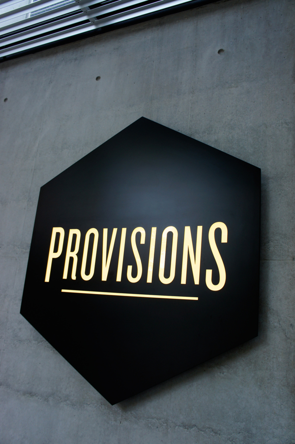
I’m adding this to my toolbox of ideas for logo directions: simple lines, and capitalizing the first and last letters.
Always in Studio

Besides the fact that dragons are cool, I love the colors and shadows in this piece.
Utopia
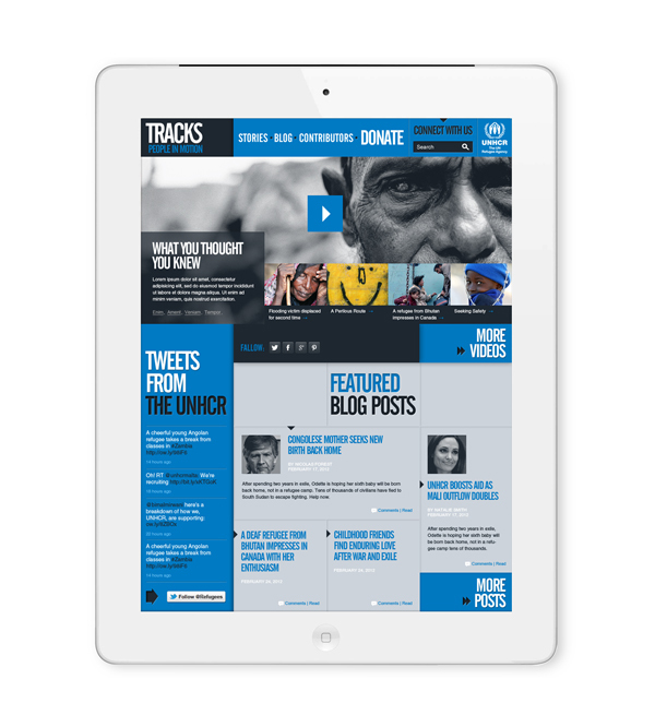

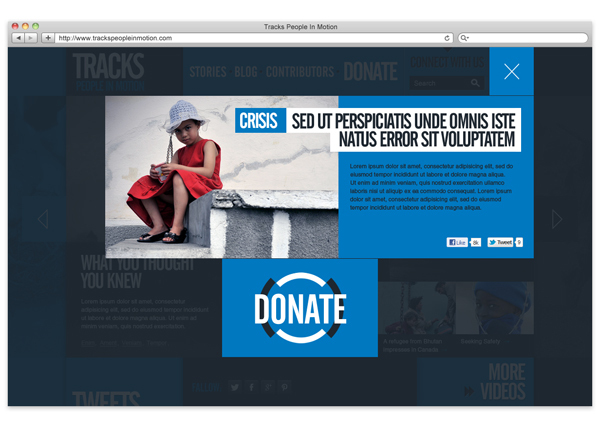
The layout of this website is stellar. Even though the design is not conventional, it doesn’t overwhelm you because the colors pull it all together and simplify it all. The layout and the colors “lead” your eyes to the most important areas of the site.
Noeekko
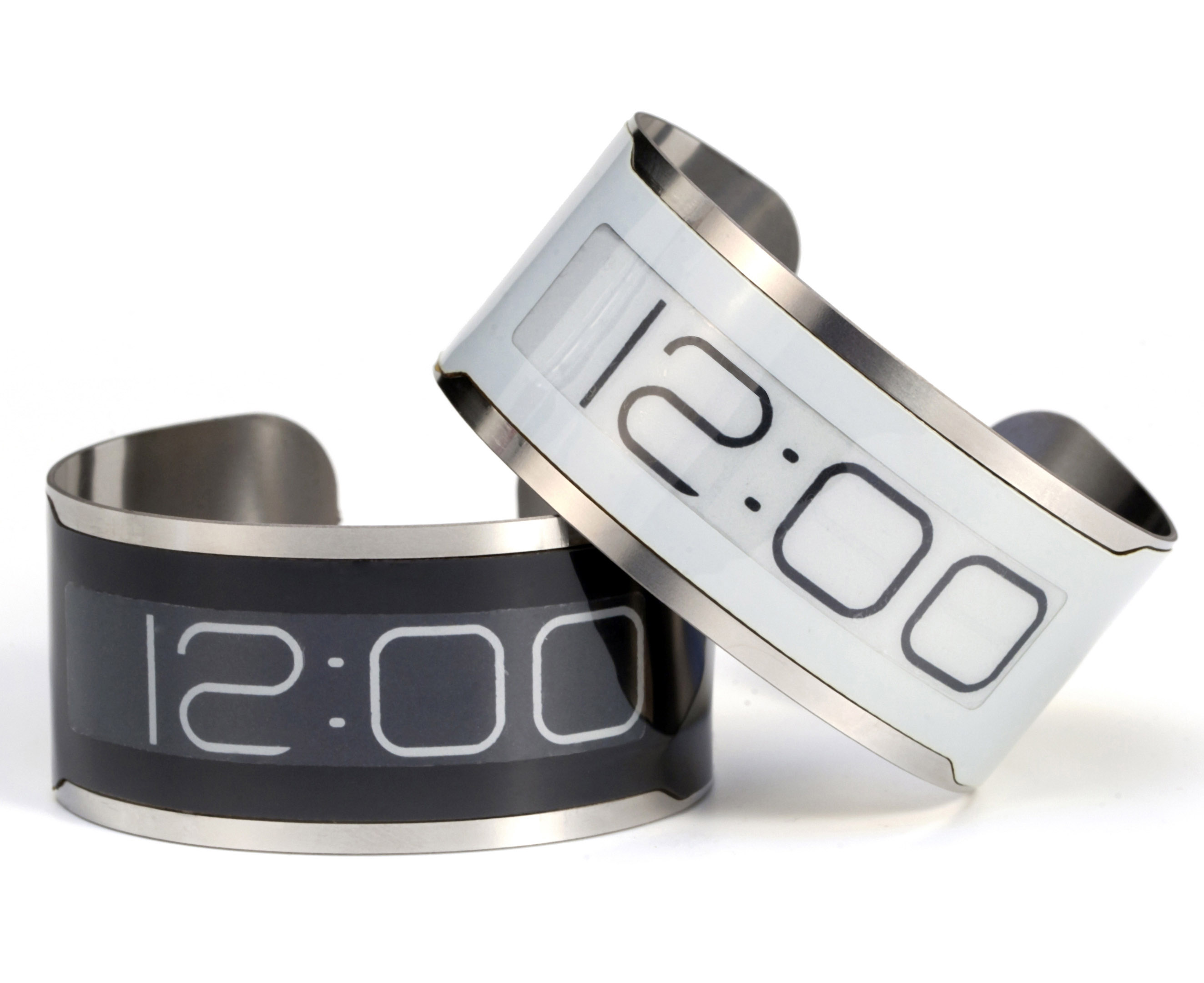
I really like this watch! Riding piggyback on the advances in e-ink technology led the designers at CST (Central Standard Timing from Chicago) to come up with this wearable piece of art. You can support them at their kickstarter page here.
Central Standard Timing

You can tell when a company prides itself on excellence when even their packaging is creative. This illustrates a practical way to separate these yummy treats while looking cool doing it.
Confection Oven
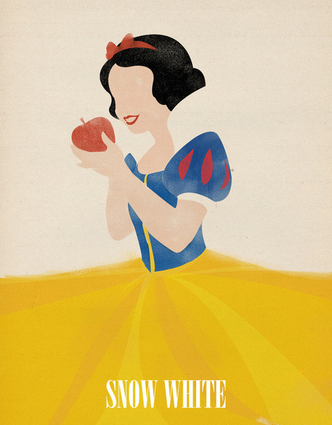
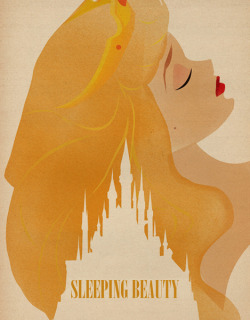
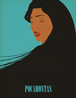
Can YOU paint with all the colors of the wind? These posters are called minimalistic for a reason. When you take everything away except for what would identify it to the eyes of the viewer, you’re left with only beauty. You know you’re singing that song right now, don’t you?
Magicblood

Talk about simplicity! This artist narrowed down every hero in the Avengers to an icon, classic!
Kimboh
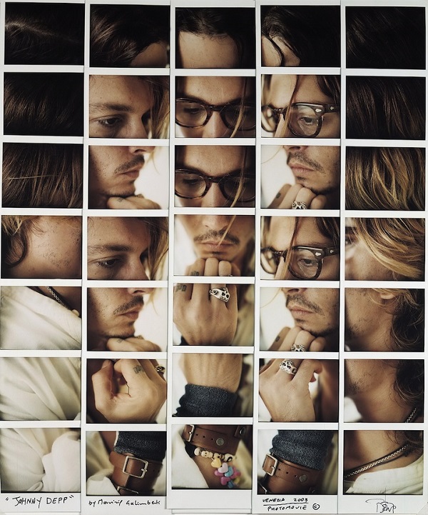
I love this idea. Maurizio Galimberti got a bunch of celebrities to take multiple photos with a polaroid and then he brought them together in a photo-mosaic.
Maurizio Galimberti
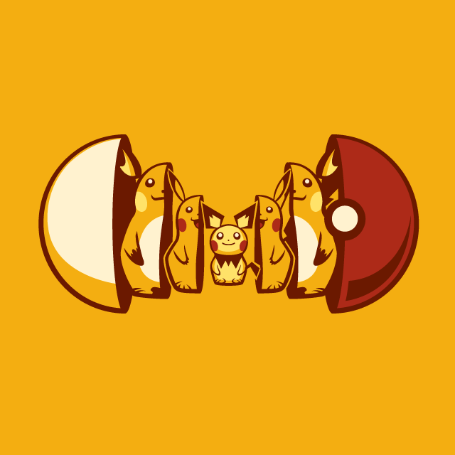
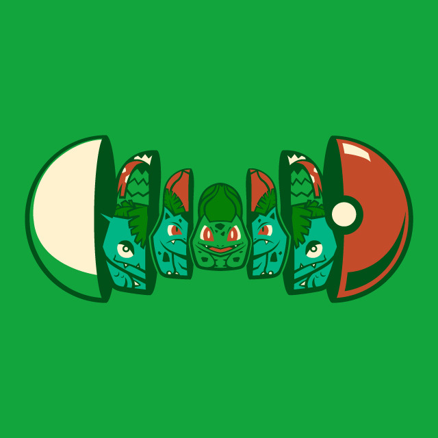
Aww, the good ol’ days… I love this concept. The linchpin idea here is thinking of the stages something goes through and pairing it with the idea of a Matryoshka doll.
Michael Myers
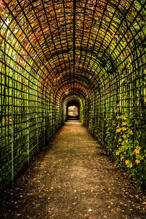
There’s something to be said about walking or driving underneath anything in nature. Just add a blur to it and it’s the perfect background for a quote poster.
Julien Kos

Lasso shoes are very simple to make and the more you wear them, the more comfy they become!
Lasso
